Reading 4
Chapters- Gestalt Principles, Framing and Hierarchy
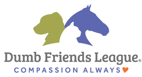
Gestalt Principles: I don’t fully understand this question, but when it comes to something that fits the Gestalt Principles, the logo Target stores have are a good example. There’s similarity in the circles as they get smaller to the single red dot. Another example is the logo for the Denver Dumb Friends League. There is closure where the silhouette of the dog and horse with the negative space that is the silhouette of the cat in the middle.
Framing: Many photos taken by phones are landscape, so we can get a wider view of whatever was captured by the camera. The same can be said for videos used, because we want to be able to see more than the portrait framing.
Hierarchy: I don’t think I used hierarchy very well in my pamphlet, because everything was placed in a fairly even way. I suppose the fact that I took one page and added the release dates and timeline, some hierarchy could be there. At the bottom of that page I added the “what’s next?” arrow that was smaller and moved onto the next page.
Reading 3: Shape, Color, and Texture
While there are good examples for scale, there is one example that is the complete opposite: back covers on movie cases. While most movies have cases with back covers that display text so that anyone can read them with ease, there are a small handful of companies that use very small text which makes it difficult to read, so the scaling on the back of the box is bad. That combined with a poor choice of color makes things worse. Many horror movies like to use dark backgrounds with a color for the text that is equally as dark, such as a dark red on a black background.
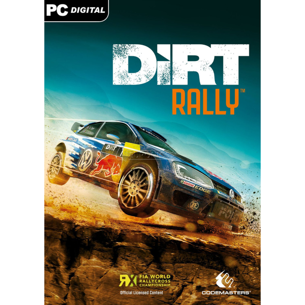
As for texture, one I can think of is for the video game, DiRT Rally. The logo is bold and bright, while also using a muddy texture on the lettering, so it complements the rest of the cover, since the company that makes the game wants you to know that’s it’s an off-road racing game. By having a bold logo be splattered with dirt or mud, it really emphasizes how you might feel when playing the game. Also by adding the car driving across the image on dirt you get the same feeling.
Reading 2: Formstorming & Point/Line/Plane, Rhythm/Balance
For the Formstorming project, I’m considering either the One Hundred Iterations, A Plus, or Breaking the Block. I think the first two might be easy to start but be challenging to finish, while the last one will be harder to start since I don’t know how to do typography yet, but might really test me.
As for the chapter readings:
When you think about it, things like rhythm and line are everywhere. The yellow and white lines in the middle of a street that dictate us where we can and can’t go while driving, the RTD Lightrail map with different colored lines to show us which line we need to get on to get to our destination, the subtle lines of an organized shelf that allows us to easily find a book or movie, or lines that we make in a store so we can pay for goods. While these examples are a good definition for line, the street lines are also good example of repetition. If these lines weren’t repeated evenly we might get confused. Another example of both line and repetition could be rhythm games like Guitar Hero or Rock Band. With a fairly simple UI of just 5 lines on the screen, players match the notes on the screen with corresponding buttons on their controller. Since the notes follow music, most of the notes follow a pattern that is repeated once or twice. That way you can memorize the song’s rhythm and get a perfect score.
Reading 1: What is a Designer?

A designer is a person that creates a type of art that is often used for business purpose or other types of visual material that can be used for a multitude of purposes. Much of this visual media is often aesthetically pleasing and simplistic so it can be easily identified as well as easy to remember, such as logos for companies, signs for road travel, and reading material like pamphlets for so those that have difficulty reading a certain language can ascertain the same level of understanding with pictures.
The designer’s main medium is a computer, with software like InDesign or Photoshop, similar to a painter’s medium being paint. There is still use of paper, but that’s mainly used to begin a project and to work up the beginnings of ideas that will eventually be formed on the computer. While it’s technically not called art, a designer’s projects can still come off as art, because like other forms of art, it takes time and dedication to make something, even if it’s a little faster on a computer than a painting is on canvas.
